Friday, March 18, 2011
Animation is COMPLETE!!
It's done, it's over, finally! This was an...interesting experiment to say the least. I will be the first one to admit that digital mediums, even though I'm practicing with them far more and have become more adept than before, still eludes me from time to time. Let alone a full blown animation. Even though there were time that I just wanted to give up and let this rot, I finished it. I've defiantly learned a lot from this whole process. Not sure if I will ever do it again, but I have picked up some nifty tricks.
Sunday, March 13, 2011
Busy, at the moment...
It's finals here at DAAP and UC. So, if I'm not posting, it's because I'm being a good studious student and preparing for the end of the quarter.
Don't believe me? LOOK AT THESE HANDS.


After finals, I shall post what I'm proud of enough to go on the internet. Let's just hope finals don't kill me first...
Don't believe me? LOOK AT THESE HANDS.


After finals, I shall post what I'm proud of enough to go on the internet. Let's just hope finals don't kill me first...
Wednesday, March 2, 2011
A Very Happy Birthday
A good friend of mine isn't have the best of weeks, and to top it all off today is his birthday! So I decided to make him a drawing that will, hopefully, cheer him up. It was a quick, 45 minute little diddy but I think it turned out fairly well.

I've heard that flaming Playstation 3 controller rainbows are manliest things ever. Manlier than anything in the world.

I've heard that flaming Playstation 3 controller rainbows are manliest things ever. Manlier than anything in the world.
Monday, February 28, 2011
Hourlies
Ahh, it's spring again! Around this time weather gets warmer, snow turns to rain, and I do my hourlies. What are hourlies you ask? They are comics, done every hour, on the hour for twenty-four hours that you are awake. Don't worry if you fall asleep during this time there is no obligation to set your alarm for every hour to wake up and do a comic. That's just silly. I, myself, have tried to do this every spring for the past four years. This spring break I plan on doing it again. There's actually an official date that comic artist the world over do them, but I'm always busy on that day... Oh, well. At least I'm still doing it.
Anyways, spring break is in a few weeks and I'm super pumped about it. Until then, here are some from last years edition.


Anyways, spring break is in a few weeks and I'm super pumped about it. Until then, here are some from last years edition.


Saturday, February 26, 2011
HOW TO: Coloring and other things.
In my last how to, I showed how I scan and do my line work. Not too complicated of stuff, which is why I wanted to share it. Photoshop can be complicated, but at the same time it can be so easy to use it's laughable. That's what I feel what turns most people off from it, is that they feel as though they should know how to use it but really don't. So, they feel dumb and don't really do anything with it. I can only hope that my tutorials help ease the frustration.
Anyhow, back to the "how to"
So when we last left off, we had just gotten done with doing the line work. After this, I make a new layer. Yea, yet another layer. Get used to it. After you've done this, make sure to go to the layer options like we did selecting "overlay". This time select "multiply".


Then it's time for base colors! Aw yeah! Actually it's really not that exciting... but you are getting one step closer to it being done, so that's exciting, right? Anyways, try to pick neutral colors again. Not necessarily browns and tans, but something between the lightest light and darkest dark you want. Oh, heads up that all layers, unless specified, are all on the multiply layer mode.

Then it's shading time. Lots of shading. I didn't do too much for the sake of time, but I generally do a bit more than this. These are just the simple shadows. Make another layer for this process, since if you do, and you use the exact same color for the area you did before, because of the multiply mode that shade will automatically become darker when you apply it on your painting. This process usually has a lot of new layers depending how much shading you want to have.

Textures! I put a texture on the metal work in this next layer. I usually use pictures or textures i have scanned in, but you can find others on the internet. You just, again, make a new layer, place your texture, erase what you do not want, and set the opacity.


And now your really done!

Anyhow, back to the "how to"
So when we last left off, we had just gotten done with doing the line work. After this, I make a new layer. Yea, yet another layer. Get used to it. After you've done this, make sure to go to the layer options like we did selecting "overlay". This time select "multiply".

This does exactly like it says, it "multiplys" the layer so it's almost as if you working in the same layer, BUT NOT. Crazy, right? After all that nonsense, I usually pick a neutral tone as my base layer. By doing this you can keep a coherent tone within the piece, plus you get rid of some the edges from when you were fixing the piece.

Then it's time for base colors! Aw yeah! Actually it's really not that exciting... but you are getting one step closer to it being done, so that's exciting, right? Anyways, try to pick neutral colors again. Not necessarily browns and tans, but something between the lightest light and darkest dark you want. Oh, heads up that all layers, unless specified, are all on the multiply layer mode.

Then it's shading time. Lots of shading. I didn't do too much for the sake of time, but I generally do a bit more than this. These are just the simple shadows. Make another layer for this process, since if you do, and you use the exact same color for the area you did before, because of the multiply mode that shade will automatically become darker when you apply it on your painting. This process usually has a lot of new layers depending how much shading you want to have.

Textures! I put a texture on the metal work in this next layer. I usually use pictures or textures i have scanned in, but you can find others on the internet. You just, again, make a new layer, place your texture, erase what you do not want, and set the opacity.

Ok at this point I'm fairly happy with all my textures and shading. Now its time for lighting! My favorite part since its usually the last one for me. Create a new layer and set it to "overlay" mode. Choose two colors for a gradient...

Tadaa! Instant light source! There is usually one last step, though. Just to add details like shiney eyes and other stuff. This layer is in "normal" mode by the way, so I generally set my brush to a lower opacity.


Hope these tutorials were helpful, but most of all, HAVE FUN!
Friday, February 25, 2011
More Digetal Nonsense
The quick speed paint I did the other day really boosted my confidence. So, I decided to try more. A friend of mine requested that I do a character of hers from a story that she is writing. Not only was i confident enough to start one, but two! Yes! Two digital drawings! The second one, was sorta just me screwing around with composition and practicing drawing other things besides people (cat, elf, or otherwise).
Anyhow, here they are for all of your viewing pleasure!


Anyhow, here they are for all of your viewing pleasure!


Wednesday, February 23, 2011
Speed Painting
I don't feel at times that I have enough confidence within Photoshop at times to actually do a drawing completely in it. This means sketch and everything else. So the other day I decided "what the hell, no time like the present" and did a quick forty-five minute drawing to pass the time.
I haven't completely decided if I have the hang of or am not quite as off put by it, but it's defiantly a step in the right direction. Perhaps.
 |
| She's a witch of some sort I guess.. |
I haven't completely decided if I have the hang of or am not quite as off put by it, but it's defiantly a step in the right direction. Perhaps.
Friday, February 18, 2011
Someone Amazing
Within the studios and halls of D.A.A.P's (University of Cincinnati's School of Design, Architecture, Art, and Planning) there are a plethora of fine artists like myself that are creating all kinds of wonderful work. One of such artists, I've had the pleasure of not only becoming friends with but am always being pushed and inspired by her work. I've recently gotten to do an interview with her about her work.
First obligatory question: What is your name and what are going to Fine Arts to do?
First obligatory question: What is your name and what are going to Fine Arts to do?
My name is Allison Weyda and I am in the Fine Arts program to become a professional illustrator.
What type of art and artists inspire you?
Artists that inspire me are usually street artists and comic book illustrators because it seems that the main purpose of their art is to deliver a message or tell a story, which is the type of art that interests me. Some of my current favorite artists are Swoon, Darwyn Cooke, David Mazzucchelli, and Adam Hughes.
Your Diver print is fairly awesome in my humble opinion, what inspired you to do such a piece?
Well the print was made for class and the only requirement was to convey a sense of space and depth. I couldn’t help but think of the impossible depths of the dark ocean. The diver was put in the piece to show the vastness of the water and to convey a sinking sensation.


Have you done/planning to do any pieces that were inspired by your work of the Diver?
I have recently done a four-page comic book story based off of my Diver piece. I was having a difficult time thinking of a story, so I looked at my past work for inspiration. I decided to reuse the Diver character in a more modern setting and wrote a story where the diver is studying an old shipwreck and discovers something unexpected living in the underwater.


If you could change anything about these works what would you do differently and what do you feel has worked really well with in each?
Specifically concerning the Diver, I like the piece overall, but as a slight improvement I would make more of the diver disappear at the bottom so it is clearer to the viewer that he is sinking. My favorite aspect of the Diver piece that developed a lot better than I had expected was the contrast in tone and the textures. The use of aquatint creates a successful sense of a mysterious atmosphere. With some of my other works, especially my paintings, I feel I could just spend more time on them in general. I have slowly been improving my color with my paintings, but I am still working on composition.
If you could do any work in the future, what would it be?
I would really like to illustrate comics, but also do paintings on the side. I would also be fine with just doing illustrations for other publications, but I would really enjoy drawing full story comics and maybe even make some of my own.
If you could give any advice to any young artists, what would it be?
Well being a young artist myself it is a bit hard to give advice, but mine would be to keep an open mind and to explore and experiment with art. Exploring art is a good way to find a unique style that represents you the artist.
Monday, February 14, 2011
No More Drama
One of the main inspirations in my life, as nerdy as it may seem, is World of Warcraft. I've been playing the game for about three years now and I've had a lot of fun being able to connect with the friends I have in my real life through it. Though we may have a lot of inside jokes, most of them pertain to just how silly the game can be or how we think it's funny that there are actually people who think it more than just a game.
If I did do a comic, I don't think just be based off of just random jokes but I do want to have some story archs. Almost think of it as Calvin and Hobbes meets WoW. Except that there are more furry animals walking and talking, even wearing pants I daresay. Or at least a mixture of Elegba and Kuroiushi's "World of Warcraft, Eh?" also Kelly Meeks and Andrew Manser's "Daily Quests" webcomics. Just something lighthearted, though I would love to illustrate some of lore of the Warcraft universe.
What I do know,without a doubt, is the name of which comic: No More Drama. It was the first guild I was ever in, ever actively a part of, or ran and what made it more magical is that it was completely comprised of some of my closest friends. Even though the guild merged with another, we all proudly say that we are members of NMD. A guild made of friends, and built upon the foundation of just having fun. That's what I want to share, just how awesome and fun these people truly are to me.
 |
| See? Just like real life. |
If I did do a comic, I don't think just be based off of just random jokes but I do want to have some story archs. Almost think of it as Calvin and Hobbes meets WoW. Except that there are more furry animals walking and talking, even wearing pants I daresay. Or at least a mixture of Elegba and Kuroiushi's "World of Warcraft, Eh?" also Kelly Meeks and Andrew Manser's "Daily Quests" webcomics. Just something lighthearted, though I would love to illustrate some of lore of the Warcraft universe.
What I do know,without a doubt, is the name of which comic: No More Drama. It was the first guild I was ever in, ever actively a part of, or ran and what made it more magical is that it was completely comprised of some of my closest friends. Even though the guild merged with another, we all proudly say that we are members of NMD. A guild made of friends, and built upon the foundation of just having fun. That's what I want to share, just how awesome and fun these people truly are to me.
Sunday, February 13, 2011
HOW TO: Scanning and Lines!
I am the type of artist that generally lets the piece decide what medium it wants to be. This pretty much means I work in array of 2-d mediums, though all of my works tend to be on the more illustrative side. One of my favorite ways to work has to be with Photoshop. I can usually sketch out what i want on a good old fashioned piece of paper and then I usually do the rest in Photoshop. My way is fairly simple and doesn't require a whole lot of hassle, which is why I want to share it.
This first post, like stated, will just get you started with the actual scanning and line work. I feel as though the coloring itself can be a bit more tedious and time consuming. I want to give it full attention so I'm gonna save it for a later post.
Now lets start! Let's say you have a pretty awesome drawing that you want to take the extra time to digitally alter or color. Kinda like this one here:
Yeah that's pretty nifty but that's just a picture of drawing. Let's actually scan that bad boy (or girl, I'll leave the gender to you) I have a home scanner but if you do not library's and Kinko's/Fedex have some too but you usually have to pay for it.
For me and my home scanner, I set it for black and white photo and 300 dpi or above. You can usually go for a lower or higher dpi but 300 is usally a safe bet.
OH YEAH. Now we're getting somewhere! But there's room for improvement. Lets do some touch ups in photoshop. Open it up directly in photoshop and make sure to go to Image > Image Size > make sure resolution is between 300-500 dpi. I generally like to work that high since you get cleaner results.
Also as a side note, when you open up the scanned image in Photoshop it'll pop up in your layers as "Background" and will be locked. To fix this so you can alter the placement of the layer, simply just rename the layer! That easy! You'll have to do this if you continue with this style of coloring.
First thing I do after this is touch things up. Though I always recommend you touch things up as much as possible BEFORE you scan it, sometimes it can't be helped. Plus, scanners can pick up other things besides your drawing that you don't want in it.
The cloak wasn't doin it for me and I have no idea what was going to be in her hand. A wand? Fishing pole? Giant chicken leg? You get the idea. Just because its there when you can it in DOES NOT mean it has to be there forever. You are God and your art is your minion. Make it dance. Or not. After your done editing it make a layer that will go under this one that's just a white fill.

The next part make a new layer and set it to OVERLAY. That's how the contours of my sketches become more contrast and color. You can do whatever color you want, black isn't the only line color in the world.

Here are my lines so far. Blue and some green. Experiment and see which colors fit the drawing.
This first post, like stated, will just get you started with the actual scanning and line work. I feel as though the coloring itself can be a bit more tedious and time consuming. I want to give it full attention so I'm gonna save it for a later post.
Now lets start! Let's say you have a pretty awesome drawing that you want to take the extra time to digitally alter or color. Kinda like this one here:
Yeah that's pretty nifty but that's just a picture of drawing. Let's actually scan that bad boy (or girl, I'll leave the gender to you) I have a home scanner but if you do not library's and Kinko's/Fedex have some too but you usually have to pay for it.
 |
| Other scanners may vary but this is a fairly standard set up |
For me and my home scanner, I set it for black and white photo and 300 dpi or above. You can usually go for a lower or higher dpi but 300 is usally a safe bet.
| Add caption |
OH YEAH. Now we're getting somewhere! But there's room for improvement. Lets do some touch ups in photoshop. Open it up directly in photoshop and make sure to go to Image > Image Size > make sure resolution is between 300-500 dpi. I generally like to work that high since you get cleaner results.
 | |
| Here is what it'll look like. |
Also as a side note, when you open up the scanned image in Photoshop it'll pop up in your layers as "Background" and will be locked. To fix this so you can alter the placement of the layer, simply just rename the layer! That easy! You'll have to do this if you continue with this style of coloring.
 |
| Looks odd now but it'll get better I promise. |
First thing I do after this is touch things up. Though I always recommend you touch things up as much as possible BEFORE you scan it, sometimes it can't be helped. Plus, scanners can pick up other things besides your drawing that you don't want in it.
The cloak wasn't doin it for me and I have no idea what was going to be in her hand. A wand? Fishing pole? Giant chicken leg? You get the idea. Just because its there when you can it in DOES NOT mean it has to be there forever. You are God and your art is your minion. Make it dance. Or not. After your done editing it make a layer that will go under this one that's just a white fill.

The next part make a new layer and set it to OVERLAY. That's how the contours of my sketches become more contrast and color. You can do whatever color you want, black isn't the only line color in the world.

Here are my lines so far. Blue and some green. Experiment and see which colors fit the drawing.
Thursday, February 10, 2011
Research
I'm not gonna lie, I didn't think I did a whole lot of research. In my mind research is what you do for a paper or something. You generally think of doing a research in library, like in all the movies. Yet when I truly think about it, I do a lot of research. It's not like I plan a day around doing research for my art, it's more of: I get inspired by something and go straight to the internet. Like the other day I was watching Adventure Time on Nickelodeon and was discussing with my roommate how much I enjoy the art for it even though it's childrens show. I was wondering who came up with the idea for the show and after much searching, not only did I find who made it but I found one of the key animators blog. Natasha Allegri's blog is just a prime example of some of the artists I research. Usually after I find an artists blog like this, I vehemently follow them...along with all the other ones I follow.
The only other research I do, is to find out how to better do what I do. Thankfully, the internet has a plethora of how-to's and guides from anywhere as traditional mediums like markers, how to draw a face, and even how color digitally.
Even though I do this fairly often, I feel as though I should start to do more research outside of the internet. I feel as an artist I need to start familiarizing myself with other artists and techniques that isn't just all over the internet. Perhaps there are workshops and more shows i can go to, and who knows? You may just see me at the library doing research.
Fuel For The Fire
Just like everyone else, artists need money. As lofty as fine art can be, no one artist can deny the need for to pay for a place to live, food to eat, and of course supplies to make our art. Let me tell ya, I really worry about money, especially when it comes to bills and my taxes.
Taxes and bills for anyone is a stressful situation. I myself, am going to school full time, living on my own, and only really odd jobs here and there to try and help make ends meet so I only have to work in the summer. So needless to say I worry about money a lot and am always looking for ways to help myself stretch my money just a little more. Through an info-share that one of my classes has hosted, I may have found a helpful tool.
Fox Tax main motto is "Life isn't a business; it' an art." The whole business is dedicated to dealing with the financial needs of artists, mainly taxes. I've only really been filling my taxes for a few years now, and honestly don't know much so any help dealing with my financial needs is valuable.
Just browsing the site there's information for year round planning and advice, information about self-employment tax and estimated payment, even help you plan for retirement. I haven't even thought about retirement let alone if I will be able to! It's nice to know that there is a company out there there that is not only thinking about how I can be paying bills and saving money now but how I can doing it in the future. That's something that is invaluable to me.
Thursday, February 3, 2011
Golden Key Update
Been working almost nonstop on this project it would seem. I constantly see myself getting frustrated just due to how time consuming the process can be. It is quite literally stop motion animation so one wrong turn and you have to re-do everything that you've accomplished. It can be incredibly frustrating at times but so far it's been really rewarding as well. I'm really pushing my knowledge of what Photoshop can do and it makes me excited to think that by the end of this process I'll know that much more about something that I will want to use for other art.
Anyways, here is some stills from what I have so far. Not too much but it should hold you over till i can get a working test animation.


Anyways, here is some stills from what I have so far. Not too much but it should hold you over till i can get a working test animation.

Every time I work on this scene I get cold.

I wonder what could be under there...
Tuesday, February 1, 2011
My Influences: Alphonse Mucha
It is always exciting to see drawings, doodles, and sketches from the artists I admire. Right now I am looking around my room and see not only a calender but two posters of Alphonse Muchas work. The calender is outdated and on the wrong month but it has my favorite piece that was made by him. I sit here fairly frustrated at how it's hard for me to describe how much his work speaks to me.

His colour compositions are exquisite and the undulating curves of his lines seem to possess a magical mind of their own as they gracefully sweep through each composition. He was truly a master of his art and in complete control of every little element and detail.


Alphonse Mucha, Le fruit, c. 1897, Lithograph
His colour compositions are exquisite and the undulating curves of his lines seem to possess a magical mind of their own as they gracefully sweep through each composition. He was truly a master of his art and in complete control of every little element and detail.

Alphonse Mucha, Brunette, n.d., Postcard
While trying my hand at another self-portrait, I took it upon myself to try and do it with his style of work. Ultimatly, I have found that I need to be able to not only define my lines more effectively but I was too scarred to even apply color! At some point I would love to revisit this idea and try again.

Sarah Striker, S is for Sarah, 2009, Pen and Ink
Saturday, January 29, 2011
The Final Friday
The other night I went to The Pendleton Art Center in Cincinnati for their Final Fridays show. For those who've never been, it's a eight story building filled with artist studios. The last Friday of every month, they let artists open up their studios to the public to showcase and sell their work. There are all kinds of artists ranging from sculpture, painters, printmakers, metal work, and even some glass blowers! It's really truly a one of a kind experience to not only see so many artists and their studios but to be able to talk about their work as well.
Most of the studios are actually for real studios, but some can seem more like a store or a gallery, which weren't quite as inviting. I liked the ones that seemed like the artist actually did work in. You know, a bit messy with canvas and paints everywhere. I heard a few complaining about the smell of turpentine in one but to me, it made it more personal.
I highly suggest getting there early, especially if you don't do well with crowds. The later you get there, the more crowded it tends to get. Most studios tend to be small, so as the night progresses it gets increasingly difficult to view most of the work at a leisurely pace. Plus it's far more likely that you are able to have some one on one time with the artist.
All in all, I'm really glad I went to the Pendleton's Final Friday! I got to meet and talk to a lot of great artists and see a lot of simply amazing art. Seeing all the cool studios and just talking to people just really inspired and reminded me why I love art and want to pursue it as a career. It truly is a must for any budding artist in the area!
Thursday, January 27, 2011
My Influences: Miyazaki and Studio Ghibli
There are times when I get so enthralled with something, that I usually forget everything else about that day. One such instance was with "Spirited Away" by Studio Ghibli, directed by Hiyao Miyazaki. I don't remember what I was doing, or why i had been watching it, or even if anyone had taken me to go see it.
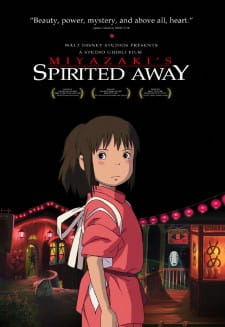
I was completely and utterly captivated by this film. The story itself was phenomenal, yet it was the animation that really drew me in. All the detail and little things that made this movie what it was blew me away. The fact that the main character was the least detailed figure in the whole movie but possibly the most expressive made me so excited that went home immediately to draw her. I would spend countless hours trying to recreate just how absolutely breathtaking all the scenery was with water colors and markers and oil pastels or whatever I thought at the moment was what made those backdrops. To say I became obsessed was an understatement.
Yet it didn't stop there. Once I figured out who created the movie there was no stopping me viewing everything he had done. This not only applied to his movies, but his concept art as well.
I've tried to take the same approach that is done in his movies as well. Though, I find it hard for myself to actually make a character so...not detailed. His characters are usually plain looking but when you're watching them within a story, they aren't so plain. Though, I do think his work has inspired me into making my stories and comics more animated and less dependent on detail, I don't think I quite got the hang of it yet.

I was completely and utterly captivated by this film. The story itself was phenomenal, yet it was the animation that really drew me in. All the detail and little things that made this movie what it was blew me away. The fact that the main character was the least detailed figure in the whole movie but possibly the most expressive made me so excited that went home immediately to draw her. I would spend countless hours trying to recreate just how absolutely breathtaking all the scenery was with water colors and markers and oil pastels or whatever I thought at the moment was what made those backdrops. To say I became obsessed was an understatement.
Yet it didn't stop there. Once I figured out who created the movie there was no stopping me viewing everything he had done. This not only applied to his movies, but his concept art as well.
 |
| Concept art for Kiki's Delivery Service |

Monday, January 24, 2011
The Golden Key
My newest project as of late is an animation. It'll be approximately three minutes in length and will feature a tale from the Brothers Grimm as my main focus. The story that i picked is honestly very, very short. It barely takes up a third of the page!
Here it is:
Obviously very short and very simple. My idea though, is to give it that story book feel by only using a very little amount of actual animation and to incorporate the text as much as possible. The majority of everything else will be sorta a collage of pictures and textures to really give it some aesthetic oomph. I intend it to fairly cute and simple since I feel as though if I really did anything else with it, it just wouldn't go over too well.
Here is screen shot of what I'm doing at the moment:

Here it is:
"In the winter time, when deep snow lay on the ground, a poor boy was forced to go out on a sledge to fetch wood. When he had gathered it together, and packed it, he wished, as he was so frozen with cold, not to go home at once, but to light a fire and warm himself a little. So he scraped away the snow, and as he was thus clearing the ground, he found a tiny, gold key. Hereupon he thought that where the key was, the lock must be also, and dug in the ground and found an iron chest. If the key does but fit it! thought he, no doubt there are precious things in that little box. He searched, but no keyhole was there. At last he discovered one, but so small that it was hardly visible. He tried it, and the key fitted it exactly. Then he turned it once round, and now we must wait until he has quite unlocked it and opened the lid, and then we shall learn what wonderful things were lying in that box."
Here is screen shot of what I'm doing at the moment:

Friday, January 21, 2011
My Influences: Bill Watterson
When I was younger, I can remember when there were just whole days where I would do absolutely nothing but read book after book of comics. Sure the only real thing that broke me from the comics was the call of a good meal, but who's counting, really? Most parent would probably be concerned hearing their child laughing hysterically by themselves for hours on end, I'm glad my parents weren't.

Bill Watterson's Calvin & Hobbes is what kept me laughing by myself, hours on end. Possibly the most acclaimed comic strip of its era, Calvin & Hobbes ran from 18 November 1985 to 31 December 1995. Calvin is a six-year-old boy, Hobbes a stuffed tiger who in Calvin's presence, and Calvin's presence only, comes to life and is capable of speech. From harrowing adventures in space and against Mutant snow goons to just dealing with the baby sitter and his parents, it follows Calvin through all aspects of life.

Yet the real appeal to this comic for me, even as a young child, were it's themes. Calvin and Hobbes are always discussing the weightier matters of life like religion, politics, and the meaning of life. Yet, it never seems heavy handed, Calvin & Hobbes take the issues an adult may prefer to leave theoretical, and apply them to everyday life with amazing simplicity and a healthy dose of humor.

Though, I do love Watterson's handling of line weight and simplicity, his style is not what i want to emulate. At some point I will want to do a story very near and dear to my heart. It's about someone in my life that I feel addresses a lot of issues. When I do decide to make it, I do NOT want to it to be heavy handed. If anyone could learn anything from Watterson, is to make light of a situation and to present an uncomfortable issue in a, well, comfortable light.
Bill Watterson's Calvin & Hobbes is what kept me laughing by myself, hours on end. Possibly the most acclaimed comic strip of its era, Calvin & Hobbes ran from 18 November 1985 to 31 December 1995. Calvin is a six-year-old boy, Hobbes a stuffed tiger who in Calvin's presence, and Calvin's presence only, comes to life and is capable of speech. From harrowing adventures in space and against Mutant snow goons to just dealing with the baby sitter and his parents, it follows Calvin through all aspects of life.
Yet the real appeal to this comic for me, even as a young child, were it's themes. Calvin and Hobbes are always discussing the weightier matters of life like religion, politics, and the meaning of life. Yet, it never seems heavy handed, Calvin & Hobbes take the issues an adult may prefer to leave theoretical, and apply them to everyday life with amazing simplicity and a healthy dose of humor.
Though, I do love Watterson's handling of line weight and simplicity, his style is not what i want to emulate. At some point I will want to do a story very near and dear to my heart. It's about someone in my life that I feel addresses a lot of issues. When I do decide to make it, I do NOT want to it to be heavy handed. If anyone could learn anything from Watterson, is to make light of a situation and to present an uncomfortable issue in a, well, comfortable light.
Tuesday, January 18, 2011
Life Drawing
I feel as though it's usually important to go back to the basics and build upon what you already know. There is no better way to do this than in a life drawing course. Even though we look at human figure everyday there are not many times that we, as an artist or not, can actually critically analysis the human figure. I feel like it's important that we continue to build upon what we know about the human figure so as to have a better understanding of it. Plus, I get a lot of enjoyment from drawing the human figure.

Here's my most recent one, done from a stock image for forty-five minutes.

Thursday, January 13, 2011
Et tu Muse?
There are, for the most part, clear cut steps for any art project. Most technical processes only really require a cut here, paste there, scribble more, less green, no glitter. Yet, no one really accounts for the infamous creative block. Muses are fickle and fleeting, and I am by no means impervious to their wishy-washy whims. My technical process can be seriously affected when I am under it's curse.
There is, of course, ways to get around it. I generally do not have the luxury of sitting around waiting for my muse to grant me a secret magical concoction of creative juices. Of course there isn't any, I have to work through and find out what will charge my creative batteries again. Doing this usually involves trying to go to my happy place. Funnily enough, my happy place usually involves creating something completely different.
Conveniently enough, I am currently in the midst of my latest block. Though I think my muse is coming back in the form of a tiny black and white fluffy cat.

Monday, January 10, 2011
Hey, Hi, Hello
Welcome, and enjoy your stay.
My name is Sarah Striker, and this hopefully if you are not terribly confused, is my art blog. The first thing I want to address is the title of my blog. Standing in fire is generally not associated with anything good. I feel as though art can be a lot like standing in fire for me though, at least the career part. It makes me nervous to the point of sweating, yet like the generations of men and women before me, it also attracts our attention and captivates us. My fire is art, its what makes me nervous yet also drives me.
I don't feel as though simple words can truly show you who I am. Let me show you some of my embers.
AC-MOI, November 2010, Photoshop


“No Words” page 1, December 2009, Pencil and Ink

My name is Sarah Striker, and this hopefully if you are not terribly confused, is my art blog. The first thing I want to address is the title of my blog. Standing in fire is generally not associated with anything good. I feel as though art can be a lot like standing in fire for me though, at least the career part. It makes me nervous to the point of sweating, yet like the generations of men and women before me, it also attracts our attention and captivates us. My fire is art, its what makes me nervous yet also drives me.
I don't feel as though simple words can truly show you who I am. Let me show you some of my embers.

AC-MOI, November 2010, Photoshop

Mothers Lament, February 2009, Mixed Media

Flobots Poster, December 2008, Photoshop

“No Words” page 1, December 2009, Pencil and Ink

Personal Buddha, March 2011, Oil Paint on wood
Subscribe to:
Comments (Atom)